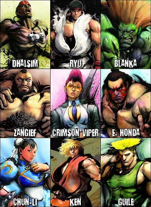
Capcom has shared some new screenshots and official game art from Street Fighter IV with Japanese weekly magazine Famitsu, and since I love both Street Fighter and video game art so much I wanted to show them here. All 8 original playable characters from Street Fighter II: The World Warrior are back and look tougher than ever, probably because they seem to be made out of rocks. They are joined by newcomer Crimson Viper, an odd-looking chick in a business suit and yellow sunglasses. This new art style takes a while to get used to, but I’m digging it. As long as the game is balanced, plays as fast and furious as SFII Turbo and the fighting engine is as deep as SFIII I’ll be perfectly happy with Street Fighter IV, even if it's not in 2D.


2 Comments:
I'm not too fond of this art style, but well, they're trying something different....
So..'Crimson Viper' is supposed to be a sexy nerd? That's...pretty cool, I guess. And of course, she HAS to keep her shirt open at the top. It distracts enemies, perhaps.
I was repulsed by it at first, judging from the first screenshots, but I do appreciate Capcom trying something different, like you mentioned. Alpha's style was more cartoonish than SFII's, and SFIII’s style was even more detailed and refined than ever. SFEX had lifeless colored blocks slapping each other, so at least SFIV's style looks better than that. Too bad they gave Chun-Li horrible man-hands.
Sexy nerds are always welcome.
Post a Comment